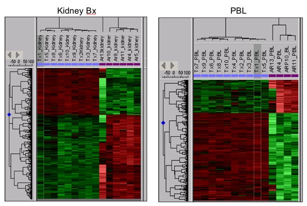
Heat maps are one computational tool for comparing gene expression
results between multiple experimental samples. The heat map in this
figure represents the data for all the transplant patients studied by
gene profiles of either kidney transplant biopsies or peripheral
blood cells (PBL). The degree of color, ranging from green to red,
represents the relative level of gene expression for each gene in
each sample. The results for several thousand genes are given here.
What is evident simply by looking at the color patterns is that the
acute rejection profiles (named AR in the figure) in both the
biopsies and PBL are very different than those of the transplants
with excellent function (named TX in the figure). This is one part of
the evidence that gene expression profiling can be used
diagnostically in transplantation.